
I’ve been building a creativity wiki with Claude and at some point I needed to map the full landscape of chart types — which ones exist and when to use them.
I wanted this because I do a fair share of presentations and I was exhausted babysitting the prompt window when building decks with Claude. Claude's presentation skills are incredible (in html), but the visuals are often repetitive, probably my fault more than Claude's. I had no visual language to tell Claude what I wanted. I couldn't point to a vocabulary of forms and say in this style, not that one, because I didn't have the vocabulary.
So I asked Claude to generate a comprehensive list of charts and graphs as a reference doc.
The wall of text
I was thinking that a written reference doc would give me the language I was missing to prompt Claude toward better visuals. What came back was a wall of text — over a hundred different chart types and descriptions, the kind of output that is technically accurate but practically impenetrable. I've become allergic to this: The wall of undifferentiated information that doesn't speak because everything is the same size, the same shape, the same monotone. The mind needs contrast and texture, especially in this age where we are living in prompt windows and reading mountains of text.
Building a visual chart dictionary overnight
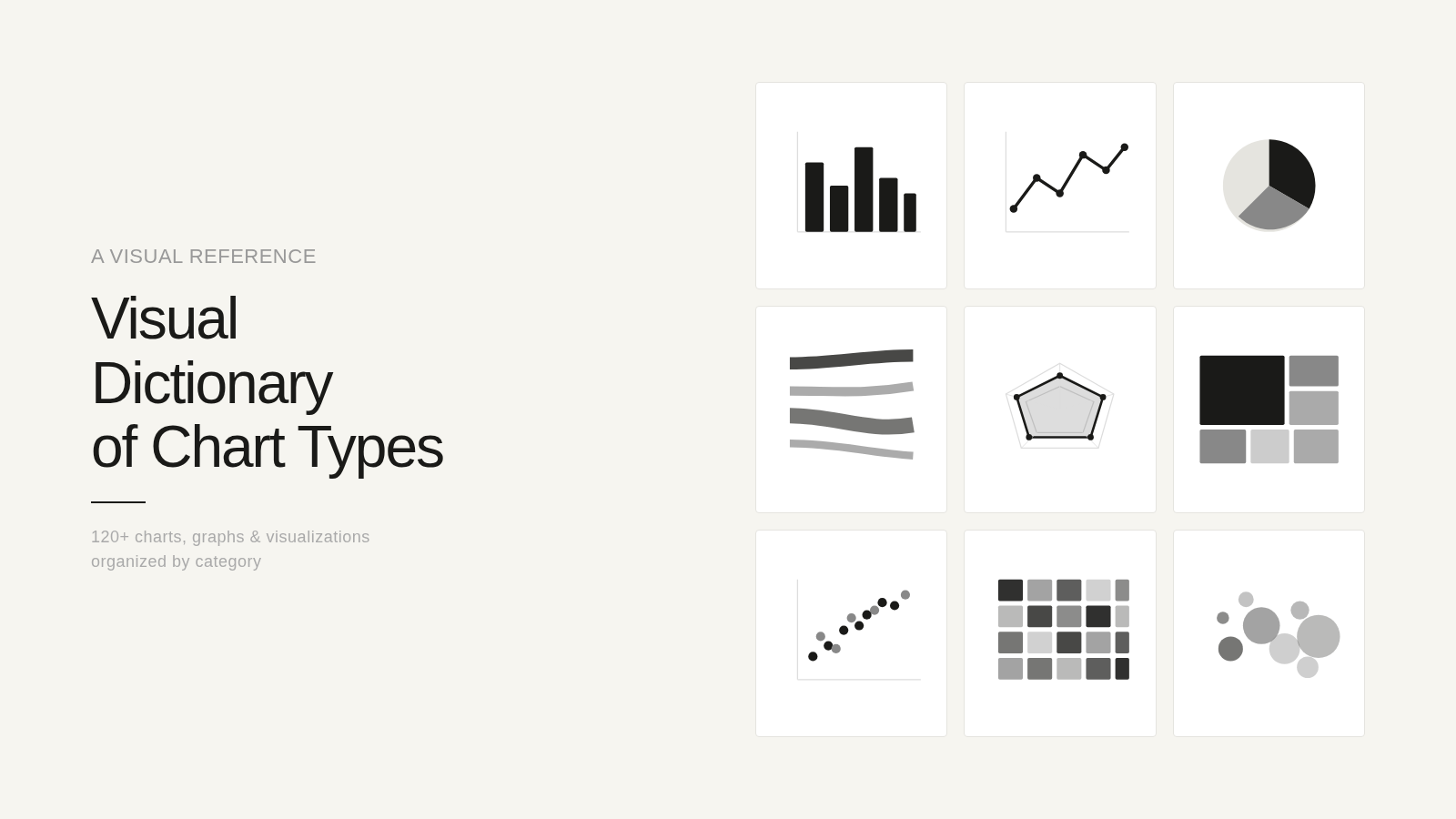
The list was comprehensive but wasn't clear. That's when I opened Claude Code. I realized both Claude and I needed a visual taxonomy, so at 10:15 at night, just before I closed my laptop, I asked Claude to build a visual dictionary of all our chart types. What it did — overnight — was convert the multi-page doc into this visual. It’s not as complex as coding an app, (it’s just html, a website basically), but it worked.
Here's how (and this process took 10 min for me and approx 35-minutes for Claude):
I opened Claude Code on my desktop — it runs in a terminal, but you don't need to know terminal commands. You talk to it the way you talk to Claude in conversation.
I described what I wanted — an interactive visual dictionary. Claude suggested rendering every chart type as an actual SVG thumbnail, browsable by category, clickable to enlarge, with a description for every chart. One self-contained file, no dependencies.
I pointed it at the taxonomy — a doc we'd already built together in conversation, the categories, the names, the descriptions. This was the blueprint.
I went to sleep. Important step here.
Claude Code started building. It wrote the HTML, generated every SVG by hand, organized the categories, built the filtering and the click-to-enlarge modals.
I woke up and opened Dispatch on my phone to check on it, the way you'd check on bread in the oven. It had finished.
What I woke up to
By morning it had produced a single HTML file. Inside it, 120 clear visualizations across 15 categories — Sankey diagrams and Voronoi tessellations, ridgeline plots and strange attractors, frameworks and scientific charts, etc. Each one filterable, clickable, quiet and clean. One file that held everything I couldn't articulate the week before.
What I learned
The conversation was the blueprint. The taxonomy we built in conversation gave Claude Code a clear target. Without that earlier thinking, the build would have been aimless. Conversation first, construction second.
A visual language changes what you can ask for. Now when I'm working with Claude on a presentation or a dashboard, I can point to a specific chart form and say this not that. The dictionary solved the original problem — not by generating better charts, but by giving me the vocabulary to direct the work.
The gap between idea and visualization has never been smaller. I didn't write code, configure a server, or touch a terminal. I thought out loud with Claude until something took shape, and then I let it build while I slept.